


 Whether we perceive a color as warm or cool is relative to the particular color and its surrounding colors. Generally, reds, yellows, and oranges are warm colors, while blues, greens, and violets are considered cool. Warm colors tend to “advance” or “condense” a room, while cool colors “recede” or “expand” a room. Combining both warm and cool colors in a decorating scheme intensifies the temperature of the respective colors.
Intensity
Intensity (or choma) refers to a color’s purity or brightness and, conversely, its dullness. The purer or less gray a color, the more intensity it has. Bright yellow and cherry red are high-intensity colors; ochre and brick are low-intensity colors. Try using intense colors as accents in your decore. Intense colors add energy to a room, while lower-intensity colors can give a room a calming effect.
 |
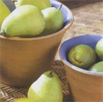
Direct Sunlight Considered the ideal light source, natural sunlight maintains a neutral balance between Both warm (yellow cast) and cool (blue cast) ends of the light spectrum. Northern Light is the coolest, while light from a southern exposure is most intense. Here, Direct sunlight provides the “truest” rendition of the colors in this room. |
 |
Indirect Sunlight Natural sunlight is not consistent. It changes throughout the day from sunrise to sunset. The intense golden rays and subsequent distinct shadows of a sunny, late afternoon have a profound effect on the colors in this room. |
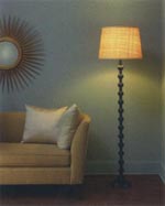 |
Artificial Light The color rendition appears warm under incandescent and halogen lights where reds yellow are enhanced, and blues and greens are dulled. Under the cool cast of fluorescent lights, blues and greens are enhanced, while reds and yellows are muted. |
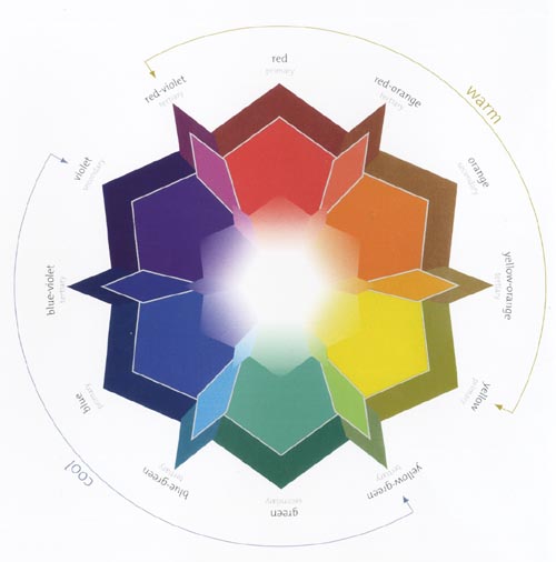
The Color Wheel
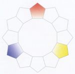
The standard color wheel includes high-intensity, pure colors. While you may not use these vibrant colors in your home as they appear on the wheel, the principles associated with this handy tool can help you create your desired effect. There are 12 colors in a standard color wheel that are divided into three designations: primary color (pure red, blue, and yellow);secondary colors, which are a combination of two primary colors and include orange (red and yellow), green (yellow and blue) and violet (blue and red); and tertiary colors, which are a combination of a primary and a secondary color. Tertiary colors are identified by the names of the colors used, such as blue-green, yellow-green, blue-violet, red-violet, red-orange, and yellow-orange.
The language of Color
Some frequently used terms regarding color: Hue Another name for color, hue refers to the color family, such as red, blue or yellow. Shade A color or hue that is mixed with black or gray Tint A color or hue that is mixed with white. Value The relative lightness or darkness of a color.
Starting Points for Decorating a Room
|
|
| Determining Your Color Preferences and Developing Your Color Palette Take a look at your collection of items and consider the following:
Begin grouping colors to see which ones appeal most to you. |
|
|
Editing Your Collection of Ideas
Your final choices should please your eye, feel balanced, and create the mood or feeling that you want. |
|
 |
 |
 |
 |
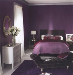

Monochromatic
Color schemes that use tints and shade of the same color.
The effect of a monochromatic color scheme can be subtle and subdued when using a soft color, or dramatic and daring when opting for a rich hue like the deep violet we selected for this bedroom. To keep things interesting, the bedding incorporated slight shifts in color, from garden-fresh hyacinth to deep, rich eggplant. Dashes of crisp white in the pillows, lamps, window coverings, floor, and furnishings – even in the floral bouquet – add to the room’s dramatic feel.
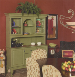
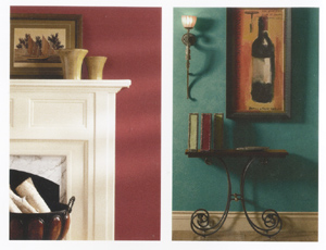
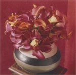
 Complementary
Includes the two colors that oppose each other on the color wheel.
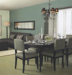
Opposites attract, so it’s no surprise that complementary colors are pleasing to the eye. The warm brick red and rich avocado hues in this dining room bring out the best in one another. Complementary colors enhance each other’s temperature, adding interest and energy to the décor – the perfect color foil for this room’s whimsical accessories.

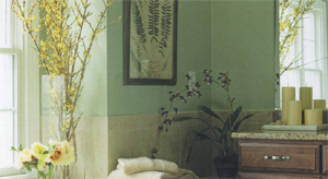
Analogous
Use consecutive colors on the color wheel. Create a pleasing palette by using one more prominently than the other two.
A variety of greens create an analogous color scheme that is both soothing and sensational. The tonal richness of these colors beautifully complements the contemporary furnishings of this living space. A refreshing blue-green covers the wall adjoining both the dining room and living room, maintaining the spaciousness of an open floor plan. The soft green wall in the living room helps to define the space, as it coordinates with the dining area, while the yellow-green floor that runs the length of both rooms serves to anchor the overall space.
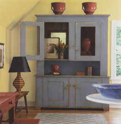
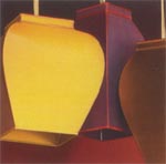
Triad
Includes any three colors equally spaces on the color wheel.Use colors in varied proportions.
A sophisticated twist to primary colors includes the smoky blue, russet red, and complex yellow used in this contemporary country room. These muted hues create a room that is colorful and livable, easily incorporating rustic furnishings with more modern accents. Note how easily the traditional glazed pottery works with the more contemporary handcrafted lamp.
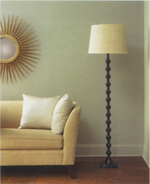
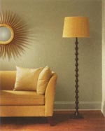
One Room, Three Looks
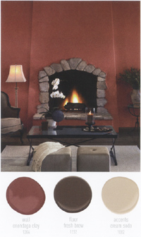
| Warm Warm colors in a room create a welcoming and vivacious energy. We raised the “heat” of this space by painting the walls an earthy, brick hue that complements the natural stone surround of the fireplace, giving the room an intimate, yet animated feel. The rich wood floor has reddish undertones that work well with the walls. To balance out the strong color intensity of the room, accents were kept in softer tones, such as the chenille throw in a frothy, whipped mocha. |
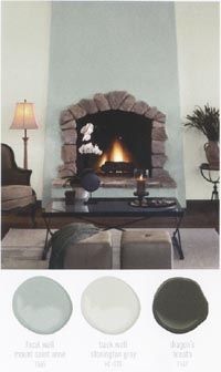
Cool Cooler colors can create a space with an expansive feel and a restful atmosphere. Our serene palette was nature-inspired, in meditative tones or silvery mist, sea spray and smoke. Soft gray walls quietly frame the subtle oceanic hue of the fireplace which provides elemental interest with its juxtaposition of fire and water. A luxurious throw in dusky charcoal helps to anchor the room without disturbing its contemplative ambiance. |
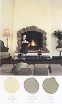
Neutral Neutral palettes are unerringly livable and beautifully balanced. Walls, the color of rich cream, allow the fireplace to take center stage without any competition. Accessories are deeper in tone as a counterpoint to the room’s ethereally pale walls. Grayed mid-tones introduce more saturated color while maintaining the space’s comfortable feel, as illustrated with our chenille throw in mellow sage and ottomans in velvety taupe. |
 |
 |
 |
Colors and Paints
Color is a dynamic element in your home’s décor, tying together room furnishings and accessories, as well as creating just the right mood, whether restful, or revitalizing.
Sheen Selection
Paint comes in different sheen levels that impact both the aesthetic and functional aspects of a room. Sheen affects the amount of light reflected from the painted surface, hiding or highlighting imperfections and affecting color perception. Sheen levels can also affect the washability of a surface, so traffic and usage can play an important role in determining sheen choice. Paint usually offers five sheen levels: flat, matte, eggshell, satin, and semi-gloss. Generally, the higher the sheen level, the easier the surface is to clean. However, the proprietary formulation of paint allows for all of our finishes to be washable and remain beautiful in any room of your home. Some tips on sheen selection include:
- A flat or matte provides excellent depth of color and is ideal for less-than-perfect surfaces and easy touch-ups. Flat is also the preferred sheen for ceilings due to its nonreflective qualities.
- The subtle sheens of eggshell and satin reveal color with a softly polished glow and provide an easy- to-clean surface that is ideal for kitchens and baths.
- Semi-gloss is particularly durable and stands up well to repeated cleanings – a must for moldings and trim. Its soft sheen provides a beautiful frame to a flat or matte wall, adding a subtle touch of reflective light to any room.